Speak Easy
Language Learning Platform
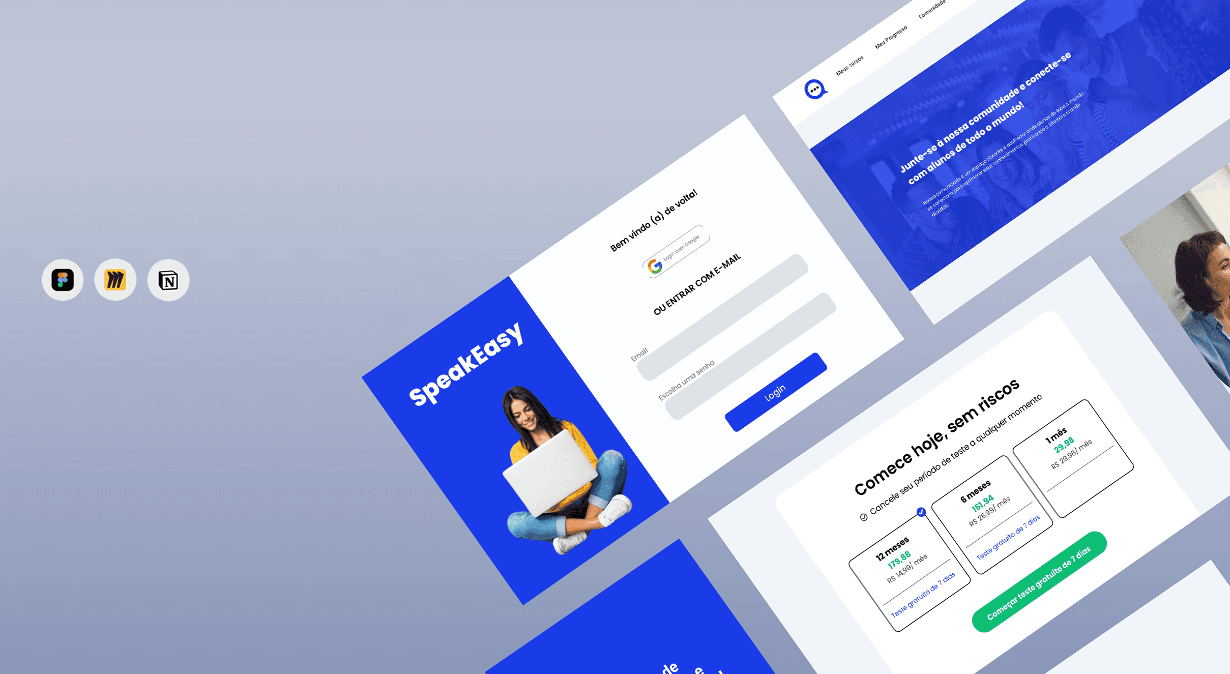
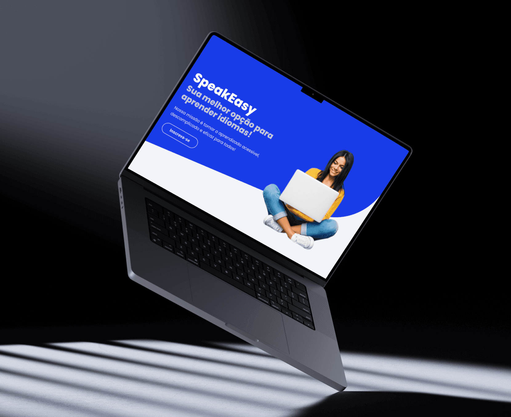
The SpeakEasy is a language platform that proposes a practical, light experience for those who wish to learn a new language autonomously. I developed this project in partnership with designer Sillas Oliveira during my work as a UX/UI Designer at the junior company: Aprimora Conhecimento. Our goal was to simulate the complete cycle of a real digital product, from research to navigable prototyping, applying the principles of user-centered design.
Challenge: How to make language learning more accessible and motivating for Brazilian students, considering their busy routines and the difficulties in maintaining consistency in their studies?
Process Steps:
Step 1 (Discovery and Research)
Desk Research
Competitive Analysis
CSD Matrix
Qualitative and Quantitative Research
Creation of Personas
User Journey
Desk Research
Competitive Analysis
CSD Matrix
Qualitative and Quantitative Research
Creation of Personas
User Journey
Step 2 (Structuring and Low-Fidelity Prototype)
Information Architecture
User Flow
Low-Fidelity Prototype
Information Architecture
User Flow
Low-Fidelity Prototype
Step 3 (Visual Identity and High-Fidelity Prototype)
Moodboard
Design System
Interactive Prototype
My Role in the Project:
Market research and analysis of existing platforms
Development of personas and navigation flows
Creation of wireframes and high-fidelity prototype in Figma
Step 1:
The project began with a competitive analysis and the construction of a CSD matrix. With this in hand, I was able to identify the problem: the clinic's website was not focused on conversion, did not clearly communicate the brand's differentiators, and did not strategically guide visitors to schedule appointments.
To better understand this scenario, I conducted exploratory research focusing on market references and user profiles.
Competitive Analysis
I observed high-end dental clinic websites, identifying good practices in design, information hierarchy, and strategies for engaging with patients. This helped me realize that it was essential to:
I observed high-end dental clinic websites, identifying good practices in design, information hierarchy, and strategies for engaging with patients. This helped me realize that it was essential to:
- Highlight treatments and differentiators of the clinic clearly and elegantly;
- Ensure visible CTAs in strategic points on the page;
- Incorporate visual elements that convey sophistication and credibility.
Persona
Based on the research, I built representative user profiles:
Based on the research, I built representative user profiles:
- Ana, 32 years old, middle to upper-class professional, seeks quality care, clear information about treatments, and ease in scheduling appointments;
- Carlos, 45 years old, entrepreneur, values efficiency, quick scheduling, and trust in the clinic team.
From these profiles, I identified the importance of creating a landing page that unites sophistication, clarity, and ease of use, guiding the user intuitively to schedule an appointment.
User Journey
I mapped the steps from the first contact with the page to the appointment scheduling, identifying three critical points:
I mapped the steps from the first contact with the page to the appointment scheduling, identifying three critical points:
- First contact with the page – the interface needs to convey trust immediately;
- Exploration of services – the user should quickly understand the treatments and differentiators of the clinic;
- Appointment scheduling – the CTA must be clear and accessible, avoiding any friction that hinders conversion.
These insights led me to Step 2, focusing on structuring information, prototyping, and creating an intuitive, elegant, and persuasive experience.
Step 2:
Based on the research data and the needs of the personas, we entered the ideation phase to organize content and create a fluid, engaging experience.Information ArchitectureWe defined the main structure of the platform focusing on three pillars: 1- Quick access to main content 2- Clear and motivating progress 3- Space for interaction between users This ensured that navigation was simple and coherent with the objectives of Ana and Carlos.User FlowThe user flow was designed to ensure fluidity between the main actions: 1- Registration and profile personalization 2- Access to study paths 3- Social participation and progress tracking The flow also considers error paths and key decisions, facilitating the development of a more empathetic and adaptable system.Low-Fidelity PrototypesWe designed initial hand-drawn wireframes focusing on content organization, usability, and information hierarchy.
Step 3:
With the product structure validated and the flows defined, we moved on to building the visual identity and developing the final interface of the application.MoodboardWe started by gathering visual references that translated the tone of the platform: friendly, accessible, and modern.
We selected soft palettes with vibrant color points, clean typography, and simple icons that conveyed lightness and dynamism.Design SystemWe created a complete visual system, ensuring consistency, accessibility, and scalability for the project. The design system included: 1- Logo and visual identity 2- Main and auxiliary colors, with adequate contrast for accessibility3- Standardized typography, with well-defined hierarchy4- Buttons, fields, icons, and spacing, composing a reusable library5- Usage rules to facilitate future implementations This system optimized the creation process and ensured cohesion across all screens.
We selected soft palettes with vibrant color points, clean typography, and simple icons that conveyed lightness and dynamism.Design SystemWe created a complete visual system, ensuring consistency, accessibility, and scalability for the project. The design system included: 1- Logo and visual identity 2- Main and auxiliary colors, with adequate contrast for accessibility3- Standardized typography, with well-defined hierarchy4- Buttons, fields, icons, and spacing, composing a reusable library5- Usage rules to facilitate future implementations This system optimized the creation process and ensured cohesion across all screens.
High-Fidelity Prototype:
With the visual elements defined, we developed the final prototype in Figma, simulating the complete navigation of the user.
Prioritized were: Intuitive and responsive flows Light and motivating interface Microinteractions that reinforce the user's progress and evolution.
Prioritized were: Intuitive and responsive flows Light and motivating interface Microinteractions that reinforce the user's progress and evolution.
Navigable Prototype:
Click here to test the prototype in Figma
Learnings:
This project was a rich opportunity to apply the complete cycle of product design in a collaborative environment, developing not only technical skills in UX and UI but also soft skills such as communication, teamwork, and creative autonomy.