A&D Dentistry
Landing Page Creation
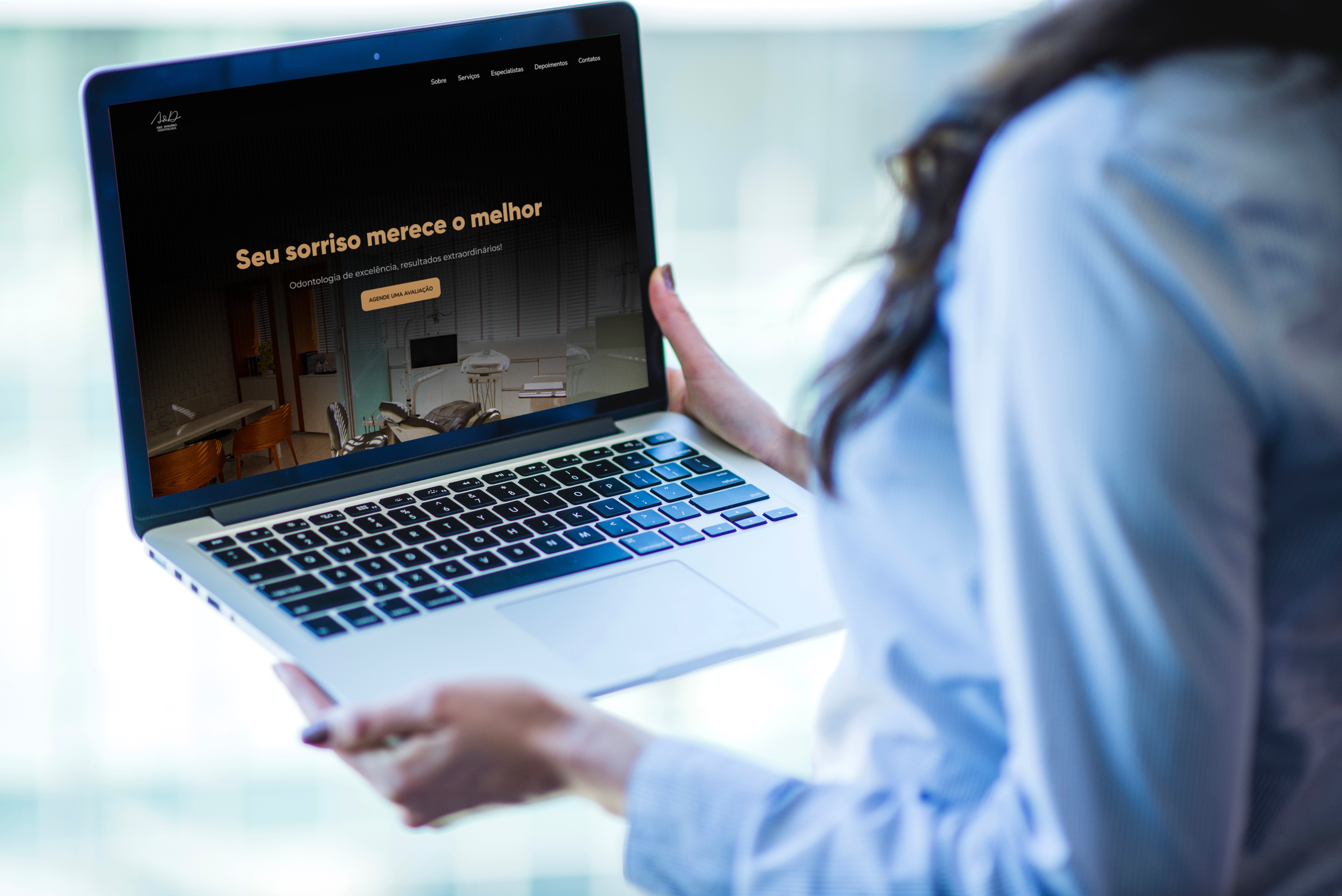
I developed the desktop interface for a landing page for A&D Dental Clinic, located in the Federal District. The goal was to boost qualified traffic and attract new patients, reinforcing the clinic's image of excellence and sophistication. The visual identity was carefully crafted to convey trust, sophistication, and commitment to oral health.
Problem:
The current website of the clinic is not focused on conversion: it does not clearly highlight the clinic's differentiators, nor does it strategically guide the visitor to the appointment booking, limiting the acquisition of new patients.
Challenge:
How to create a landing page that transforms website visitors into patients, transmitting credibility, sophistication, and clarity, while intuitively guiding the user to schedule an appointment?
Process Steps:
Step 1 (Discovery and Research)
Competitor Analysis
CSD Matrix
Creation of Personas
User Journey
Step 2 (Structuring and Low-Fidelity Prototype)
Information Architecture
User Flow
Low-Fidelity Prototype
Step 3 (Visual Identity and High-Fidelity Prototype)
Design System
Interactive Prototype
My Role in the Project:
Market research and analysis of existing websites;
Development of personas and user journey and navigation flows;
Creation of wireframes and high-fidelity prototype in Figma.
Step 1:
The project started with a desk research and the construction of a CSD matrix. With this in hand, we conducted a quantitative/qualitative research whose result led us to identify the problem: many people give up learning a new language due to lack of motivation, difficulty maintaining a routine, and unengaging methods. To better understand this scenario, we conducted exploratory research focusing on market references and user profiles.Benchmarking We analyzed three popular platforms by observing their main features, engagement strategies, and friction points. This helped us identify best practices, such as: 1- Gamified paths and rewards for consistency; 2- Classes in real context and level tests; 3- Focus on practical fluency and study plans.Persona Based on secondary analyses, we constructed the profiles of the personas: Ana and Carlos. Ana, 20 years old, an International Relations student, seeks an app that fits her routine, respects her knowledge level, and provides social interaction with other students. Carlos, 30 years old, a marketing freelancer and traveler, needs an accessible solution from anywhere, with quick, contextualized teaching that brings cultural resources and travel tips. Based on these profiles, we identified the importance of developing personalized learning paths, with practical, visually appealing content that fits each user's lifestyle.User Journey We mapped the stages from the first contact to recurring use. We identified three important points:1- Onboarding
First contact with the app. The interface needs to be clear and welcoming to avoid early abandonment.2- Continuous Lessons
When grammatical difficulties arise, the app should offer accessible support to maintain engagement.3- Maintaining Motivation
Elements such as visual progress and social interaction are essential for maintaining continuous and daily use. These points led us to step 2 of the project, focusing on a more adapted, motivating, and efficient experience.
Click here to see the entire process of step 1
Step 2:
With the insights from the research in hand, I organized the information architecture of the landing page so that each section strategically guides the user to schedule the appointment. The defined structure was:
Hero – impactful headline and main CTA;
About the clinic – presentation of the history, values, and differentiators;
Treatments offered – clear description with representative icons;
Clinic differentiators – technology, team, and personalized service;
Patient testimonials – social proof that conveys trust;
Contact form + location – quick access to appointment scheduling.
Then, I developed the User Flow, mapping the user journey from arriving at the page to scheduling the appointment. This allowed me to identify possible friction points and ensure intuitive and fluid navigation.
Finally, I created the low-fidelity prototype, presenting the layouts of each section with clear visual hierarchy, strategic positioning of CTAs, and organization of information to optimize conversion. This step served as a basis for the development of the final prototype and the visual identity.
Click here to see the entire process of step 2
Step 3:
Shortly after, I developed the Design System of the landing page, ensuring visual consistency and coherence across all interface elements. This included:
Color Palette: sophisticated shades of blue, white, and gray, conveying trust, cleanliness, and sophistication;
Typography: serif for titles, bringing elegance, and sans-serif for body text, ensuring readability;
Visual Components: standardized buttons, icons, cards, and CTAs to facilitate the experience and reinforce brand identity;
Spacing and Hierarchy: use of margins and grids to organize information and guide the user's gaze naturally.
Then, I created the interactive prototype in Figma, allowing navigation through the page as if it were a real user. The prototype showed how each section leads the visitor to the appointment scheduling, ensuring:
Fluid and intuitive experience;
Visible and strategic CTAs in key points;
Clear hierarchy of information;
Use of social proof and differentiators to reinforce credibility.
High-Fidelity Prototype:
Click here to test the prototype on Figma
Learnings:
During the development of the landing page, I enhanced my ability to combine aesthetics and usability in real projects. I learned to balance a sophisticated visual identity with a clear and intuitive user experience, as well as work with design oriented towards business goals, in this case, increasing the conversion of visitors into patients.